Links unfurl as you
Paste an event or item link into iMessage, Slack, Facebook, or LinkedIn and the preview carries your name, your item, your description, and a generated image, so it looks the same everywhere.
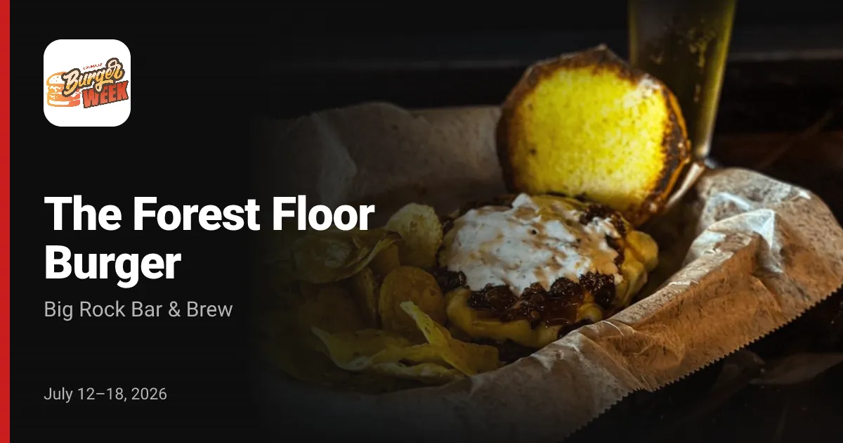
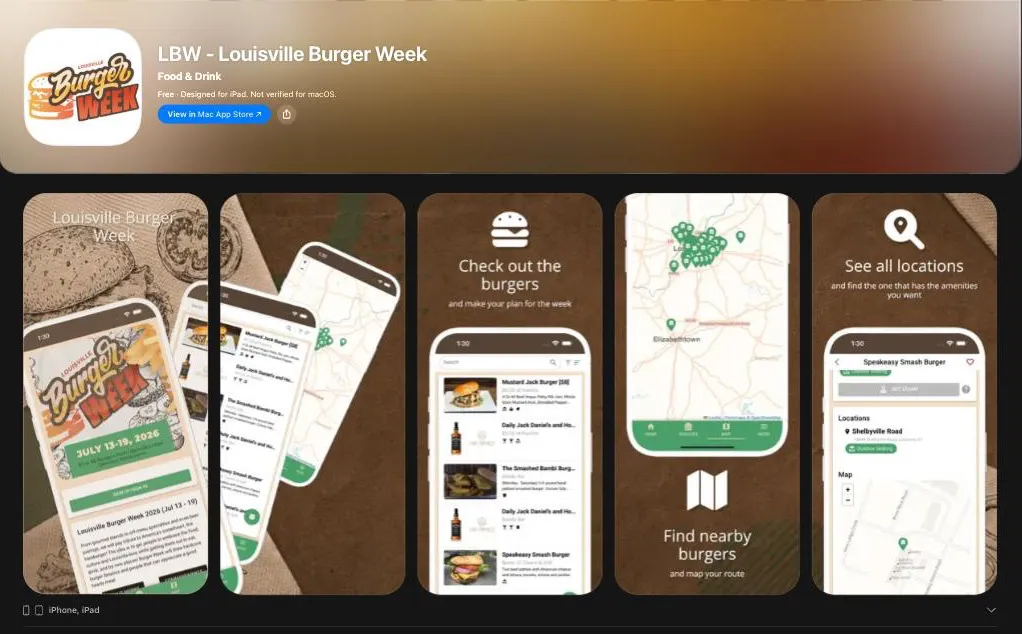
Attendees reach your event at your own domain, install it from the App Store and Google Play, and keep your icon on their home screens under your own name.
Your own app
Nobody installs FoodWeek. They search your event, find it under its own name, and get an icon on their home screen that says what your event is called.


Every event gets the same three front doors: its own domain, its own App Store listing, and its own listing on Google Play.
One color
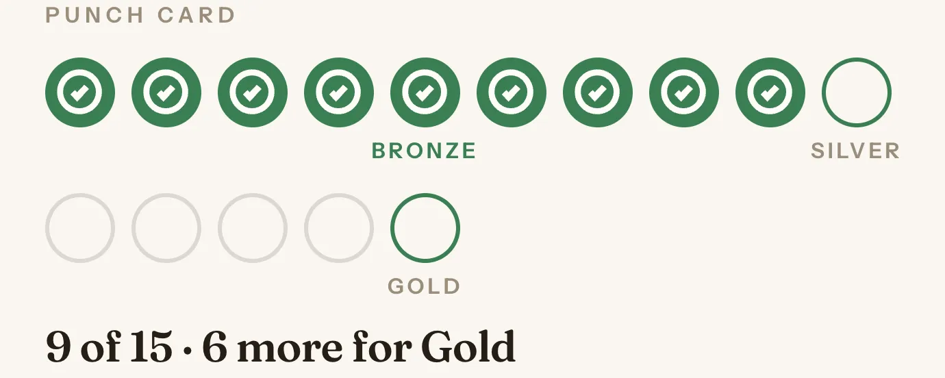
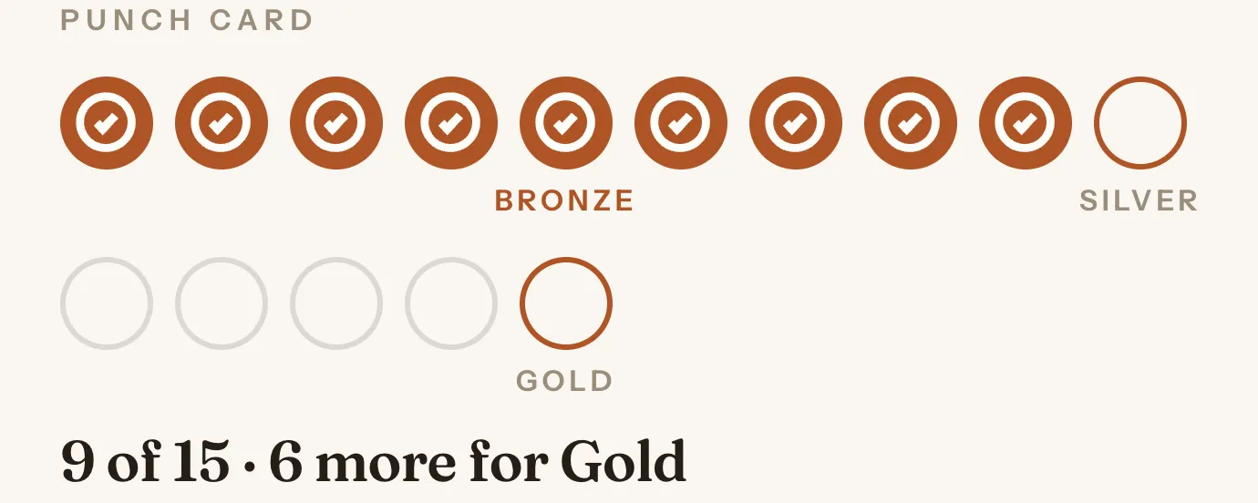
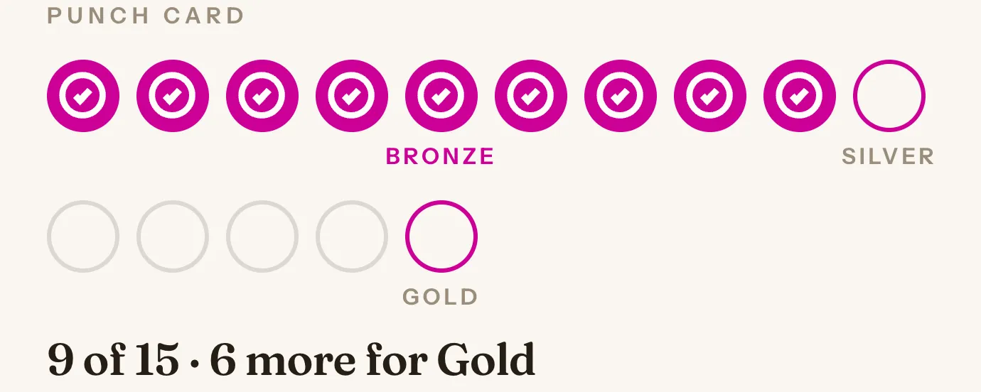
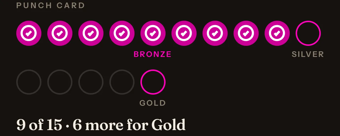
You set one color and the whole app picks it up: buttons, active tabs, map pins, the stamp.
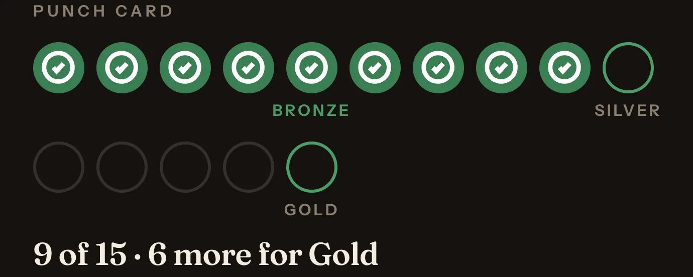
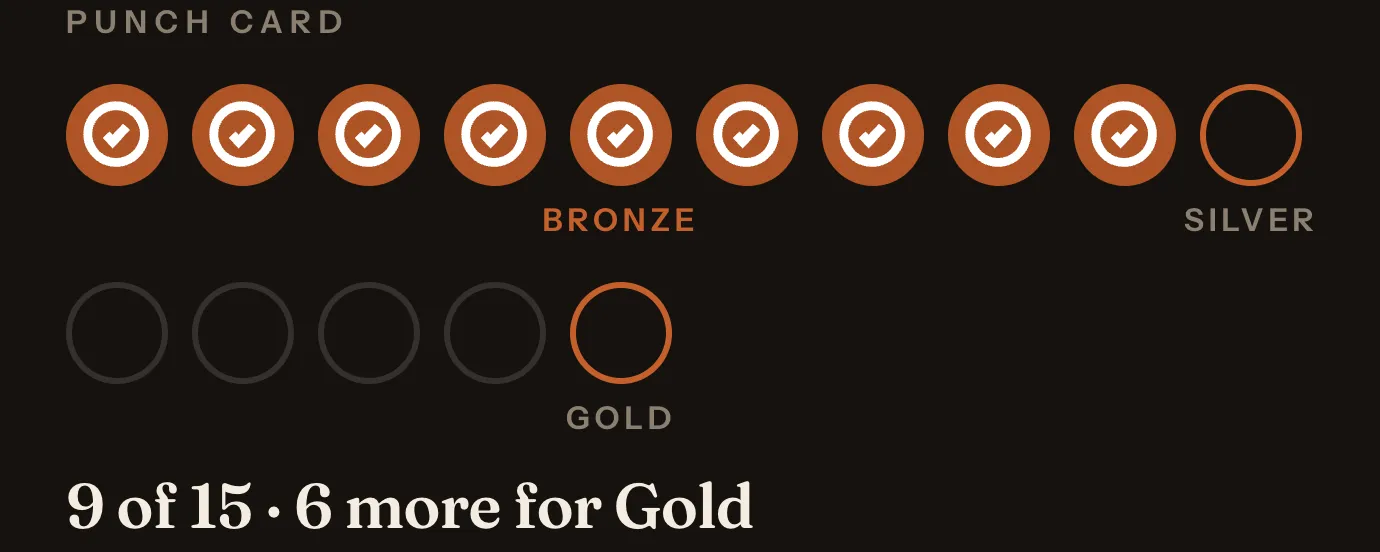
Then we nudge it lighter or darker, in light mode and in dark, until the text sitting on it meets the accessibility standard for readable text, WCAG AA. You cannot pick a color that makes your own app hard to read.
Dark mode uses the same color, adjusted the same way.
This site went through the same treatment. Our accent started as a real event’s orange, came out too light on this background, and got darkened until it passed.
Your words
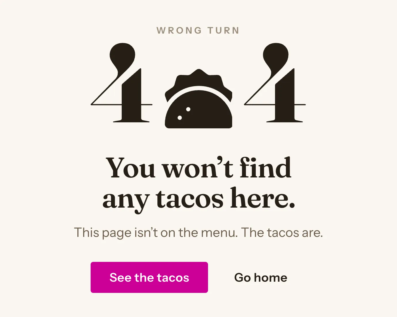
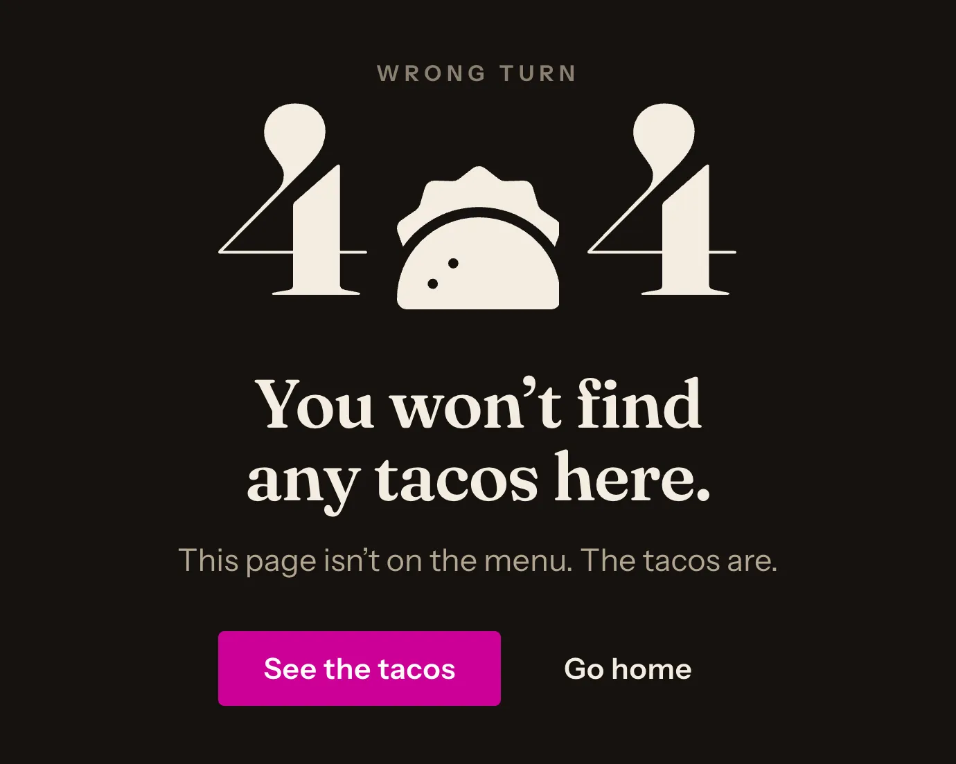
Set your word for the food once, whether that is “burger”, “taco”, or “drink”, and it shows up everywhere: the tab bar, the message when a search finds nothing (“No Tacos match your search”), the map pins, even the 404 page.
Along with your week name, your tagline, your how-it-works copy, your ground rules, your sponsor logos, and your social links.
Theme packs
A Theme changes the typefaces, their sizes, the letter spacing, and how rounded the corners are, and nothing else. Your color is still your color in all three.
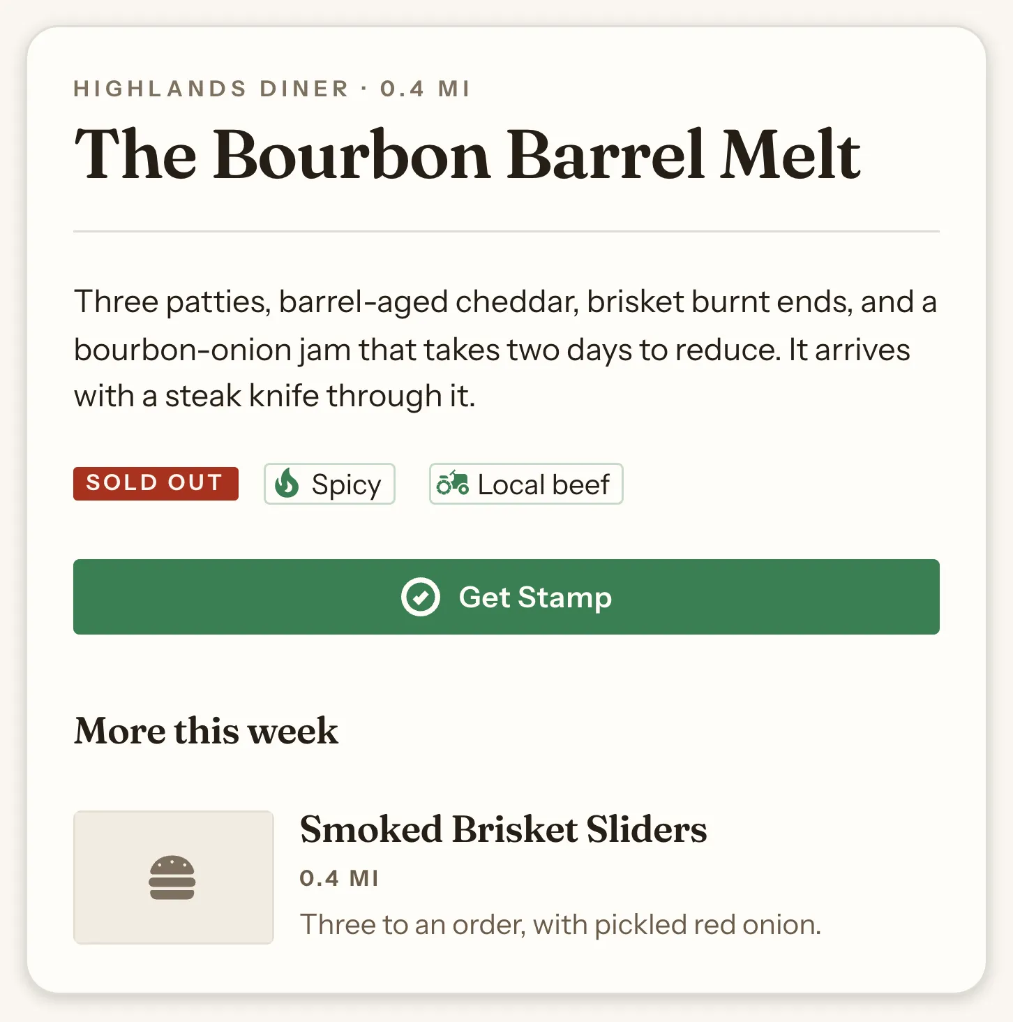
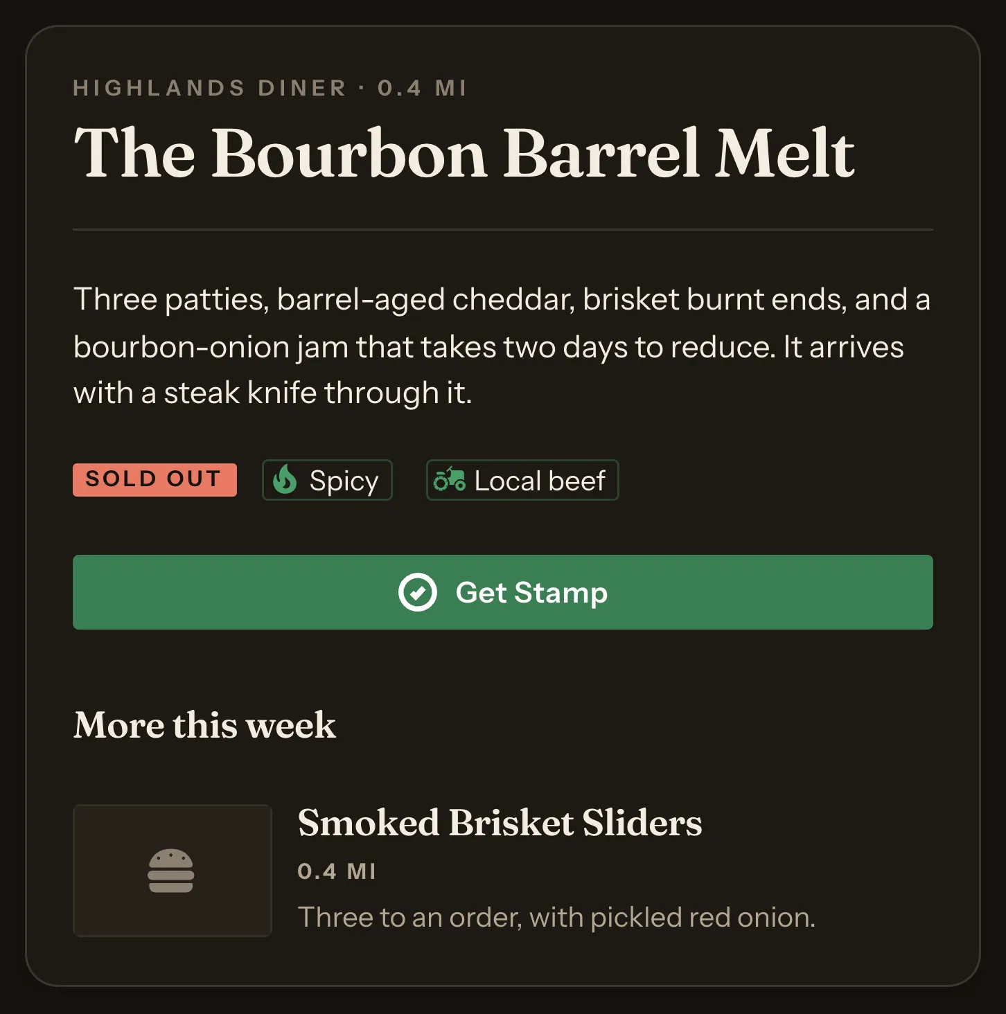
A high-contrast serif masthead over a clean sans. Magazine feel. The default.
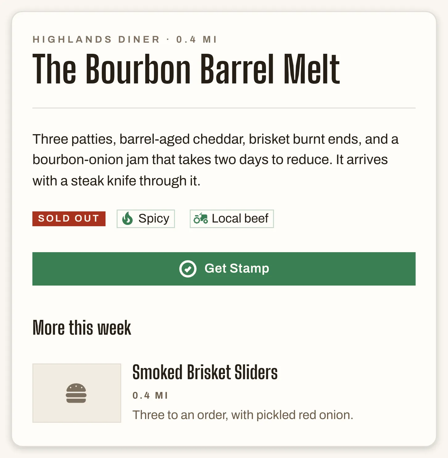
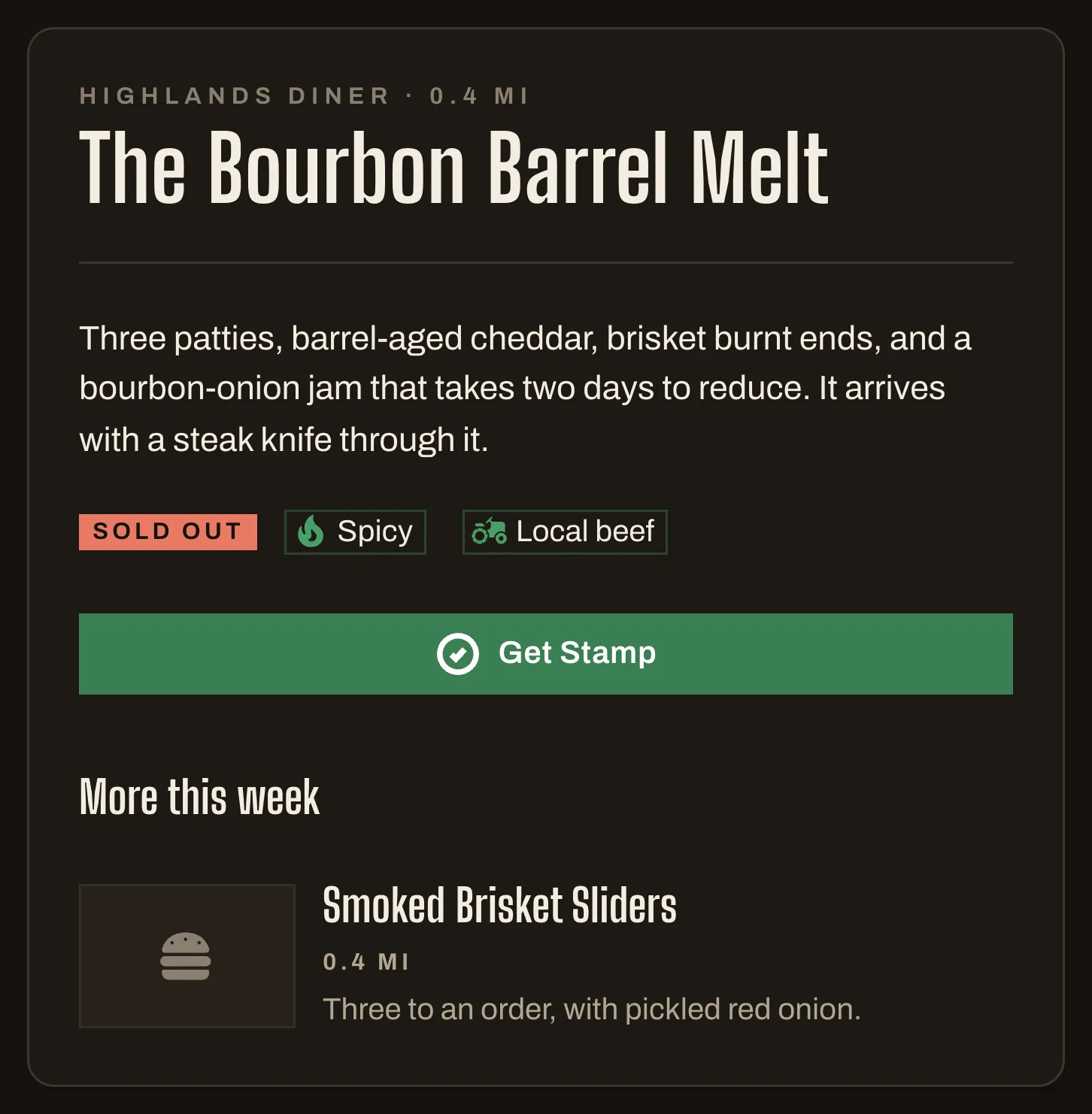
Condensed, loud, square-cornered. Reads like a hand-painted sign.
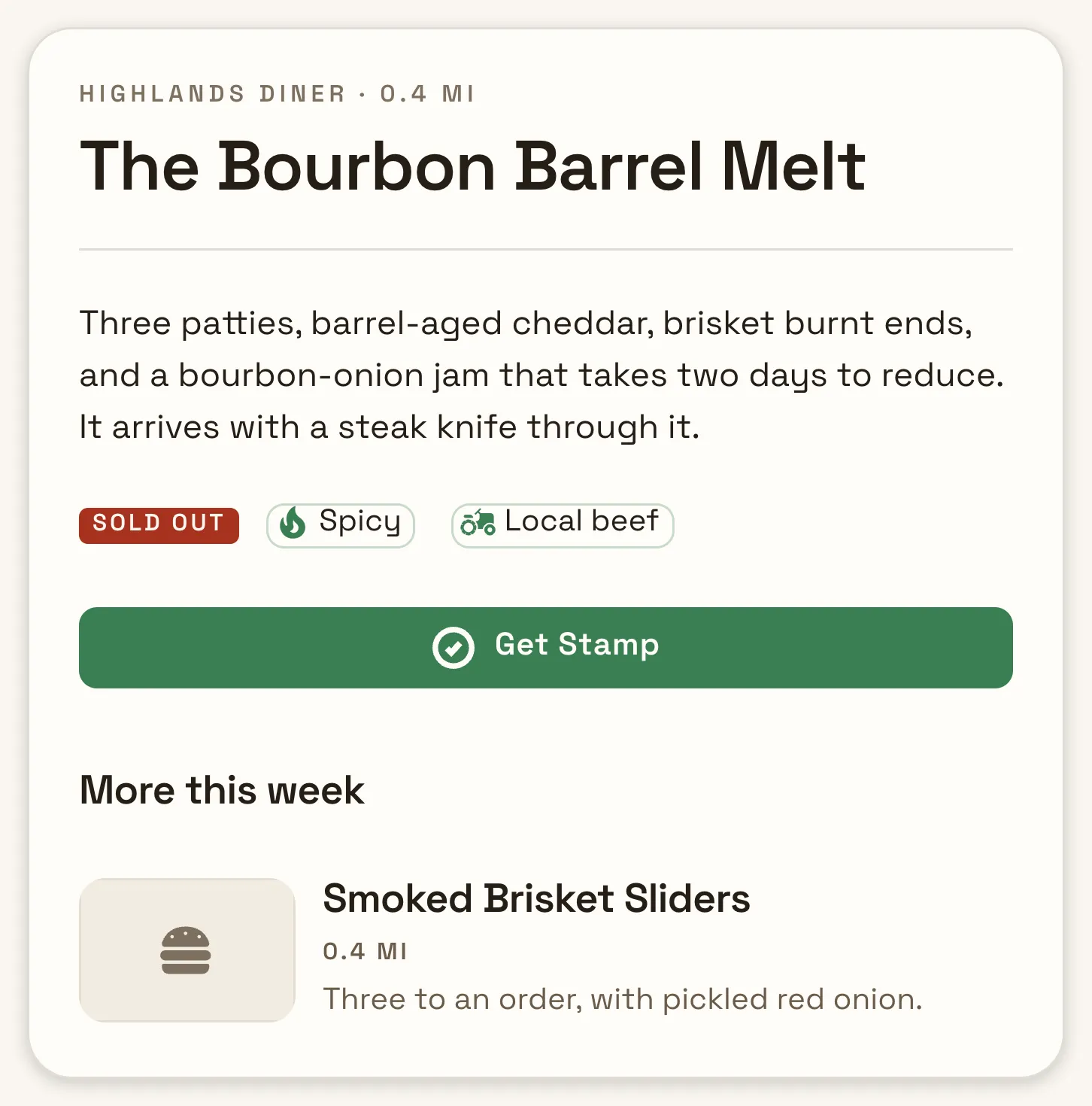
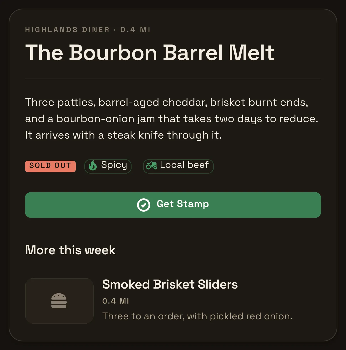
One geometric sans throughout, generous leading, soft corners.
Everywhere your brand shows up
Paste an event or item link into iMessage, Slack, Facebook, or LinkedIn and the preview carries your name, your item, your description, and a generated image, so it looks the same everywhere.
Download your code as SVG for a printer or PNG for social. It points at a landing page whose only job is the install, and that page shows the badge for whichever device scanned it.
Your icons and splash screens are generated from your artwork, your store screenshots are captured from your real content on a real iPhone, iPad, and Pixel, and your privacy policy is generated in your name.
Nobody is forced to install anything. Browse, search, map, stamps, ratings, and the Passport all run in a browser on your domain.
The same guide, map, and Passport, in whatever browser they already had open.
Next step
Send us your event and its colors, and we will get started on your app.